This is one of the big--
literally, big--projects that I was working on in October! I was contacted by the always amazing folks at the
Community Counseling Center here in Portland. Me and my sister, sister-in-law and several friends and family members, including my mom, worked on a mural here at CCC last summer
(read more about that project here!). It was a really fun experience volunteering to make this room a bright, welcoming, and safe space for kids to meet with their counselors when they come in. It was a great success, and we were all so thrilled at the response that it has received!
 |
| CCC Mural 2011 |
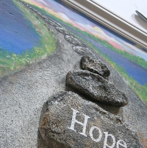
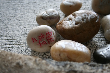
I was happy to hear from CCC again, regarding a commissioned art piece for another wall in the kids' wing. This is a piece that they had been looking forward to creating for several years, so I was honored that they thought of me to work with them in making it happen. The concept is part of a program that they offer for youths of all ages, and when each person completes the program, they receive two polished stones: one to keep, and one for CCC to keep. On these two stones, participants wrote a word or two, or drew a small image, whatever they chose to represent their feelings after "graduating" from the program. The Community Counseling Center wanted to arrange the stones in a path-like formation, where participants of the program could leave their stones as part of the on-going path toward healing and hope.
We settled on a design that would incorporate water, as well as the path itself, with larger "stepping stones" surrounded by the kids' smaller stones.
It's quite large, on a plywood board measuring 3.5' x 4'. I started by prepping the board white and drawing out the general plan in pencil. Then I went in with the background painting; we wanted something that would act as a piece of art on its own, while more stones could be added through the years.
For the large "stepping stones", I carved the shapes from styrofoam, prepped with Gesso and painted them to look like rocks.
Then, using a template of printed words that I typed up using some key words chosen by a CCC project leader, I painted the words onto the stones in white. "Hope–Healing–Community." I traced over the words on top of a layer of transfer chalk, pushing down to get a template transferred onto the styrofoam, which also embossed it a bit.
I used a pebbled/stone textured spray paint for the background of the path itself, which gave it some nice texture. I went over it after it dried, sponging some darker and brown areas for variation and depth into the distance.
 |
| Taped off painted areas before pebble spray was applied. |
Once the ground texture was sprayed and the rocks were placed, I painted some more stepping stones going off into the distance to complete the path.
It was quite moving to read all the words and see the images that the program participants had shared. It really is such a reflection of the amazing work being done there, and the strength and support provided by the staff at CCC, and it was an honor to be a part of this project.
I used white molding to create the frame, then glued on all the large faux rocks and small stone mementos to create the community-built path. The smaller stones fill in the path around the large message rocks, and the ones we had so far were placed in groupings, demonstrating how they will be able to fill in more wherever they'd like, as the program continues on.
|
I delivered the piece today, and was so happy to see how much the staff liked it and appreciated it! I don't have a full image to share, above is the best I could do from home. I hope to update with a photo of it hanging in the kids' wing when it is up!